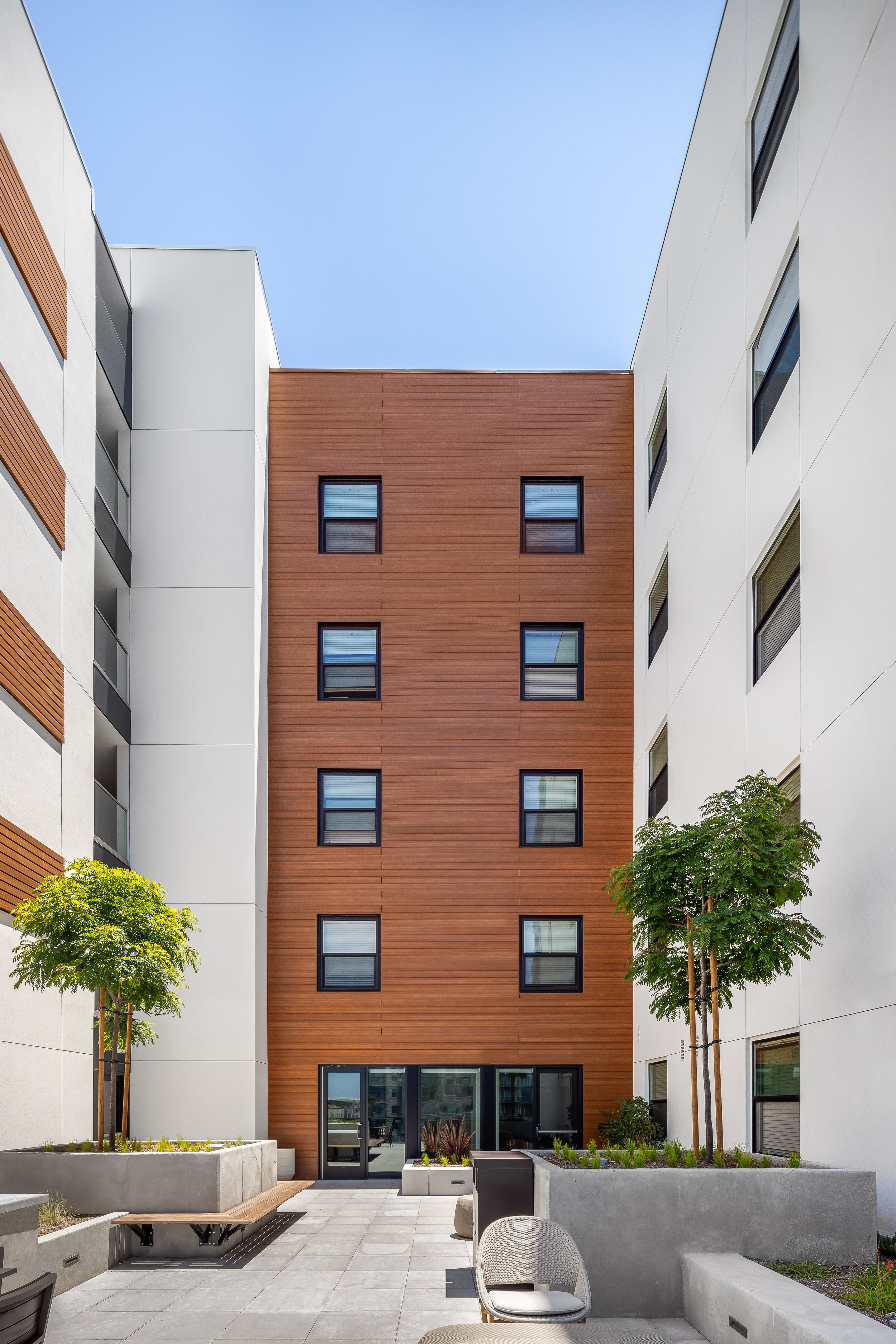
The Helm - Affirmed Housing Architecture Photography
Working with my client, Affirmed Housing, on any of their projects has a special place in my heart. When I heard they partnered on their latest affordable apartment complex with designer Carrier Johnson - I couldn’t be more excited!
Affirmed Housing’s latest build resides in Downtown San Diego, just steps from the charming Little Italy district. While I love any architecture photography shoot, there’s just something about the charm of downtown that the camera just can’t get enough of! Without further ado, let’s dive in and I’ll walk you through all the details of The Helm’s architecture shoot.
How I Planned This Architecture Photography Shoot
This shoot revolved around packing all my top lenses and cameras to have all the flexibility I needed when I arrived in person. To see a complete list of my favorite photography tech that I brought with me, check out exactly what I pack in my bag here.
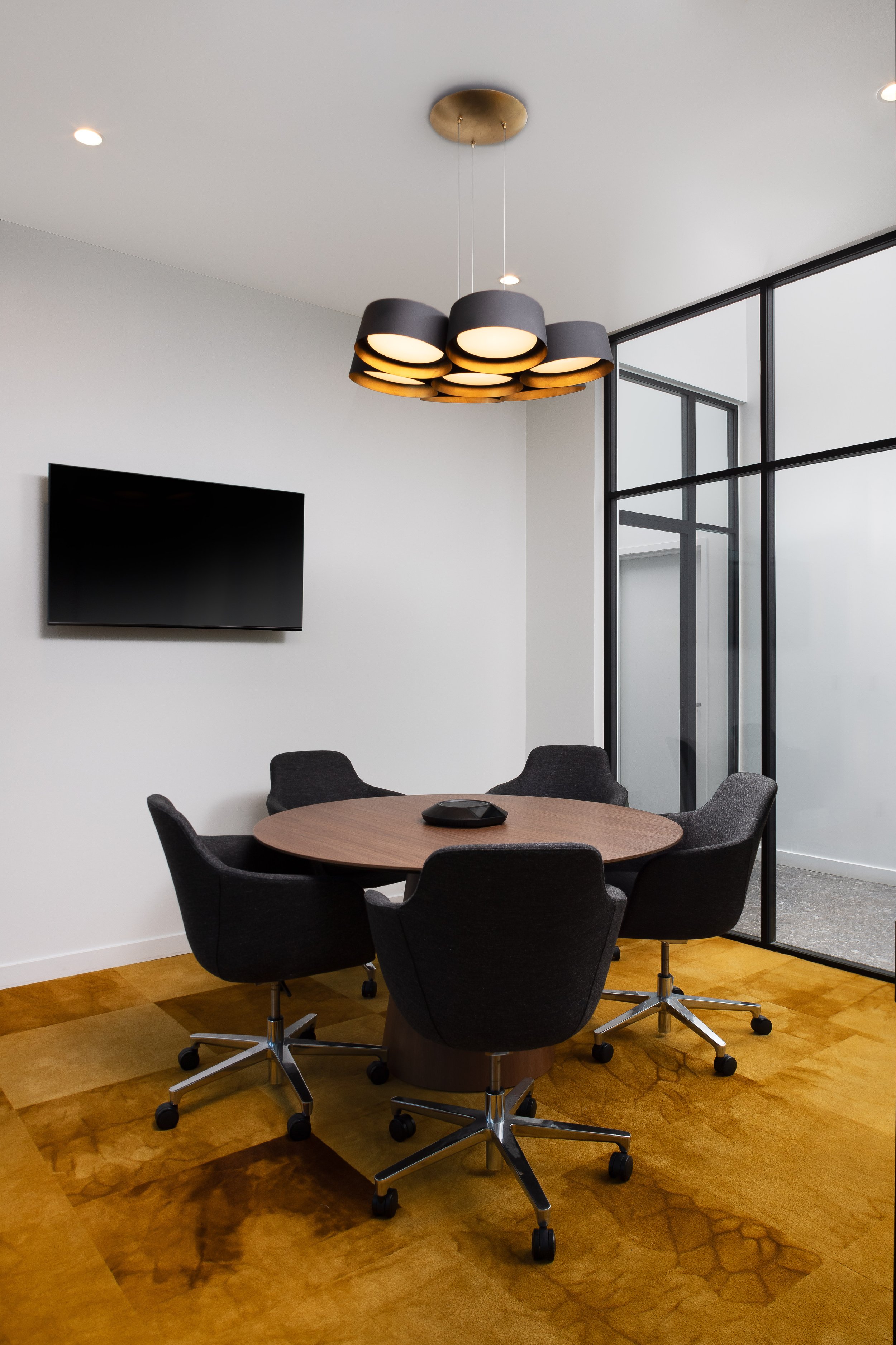
As for the interior spaces specifically, I try to err on the side of caution that a space is going to be dark, so I always bring artificial light with me. While this was not the case on the day of the shoot (it was beautifully bright everywhere), I still liked the extra lighting to balance out the spots natural beams don’t hit.
Bringing Out The Architecture Photography Tech
Working around the size and angles of architecture photography is one of my favorite challenges as a professional photographer. To really get the shots I was after, I had to utilize my dynamic duo: the Canon TS 24mm f3.5 and the Canon TS 17mm f4.0, as well as aerial photography. These two lenses are my go-to’s for ensuring every shot looks exterior shot looks fantastic, but for the sheer size of this building aerial shots were the only way to capture the architecture fully.
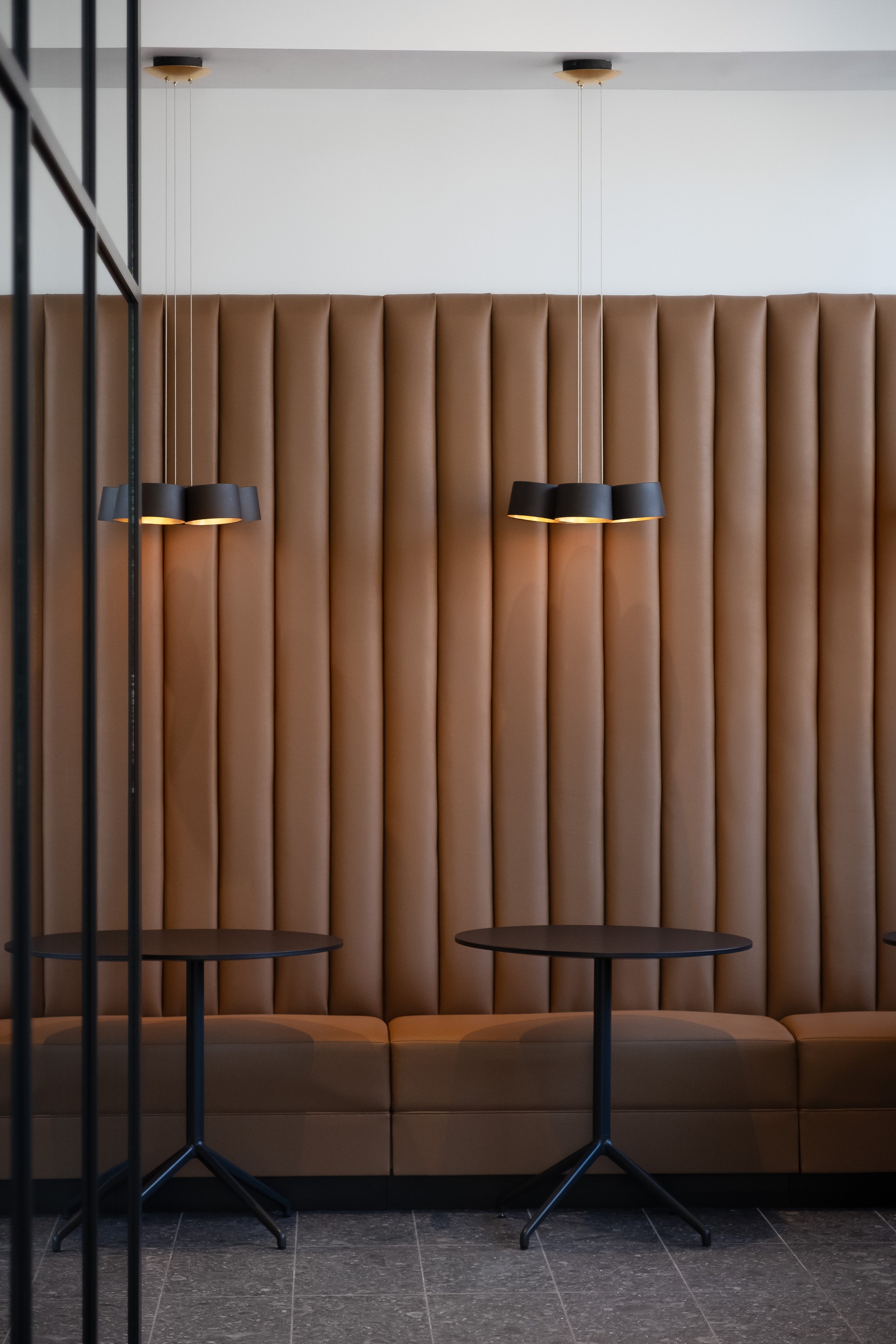
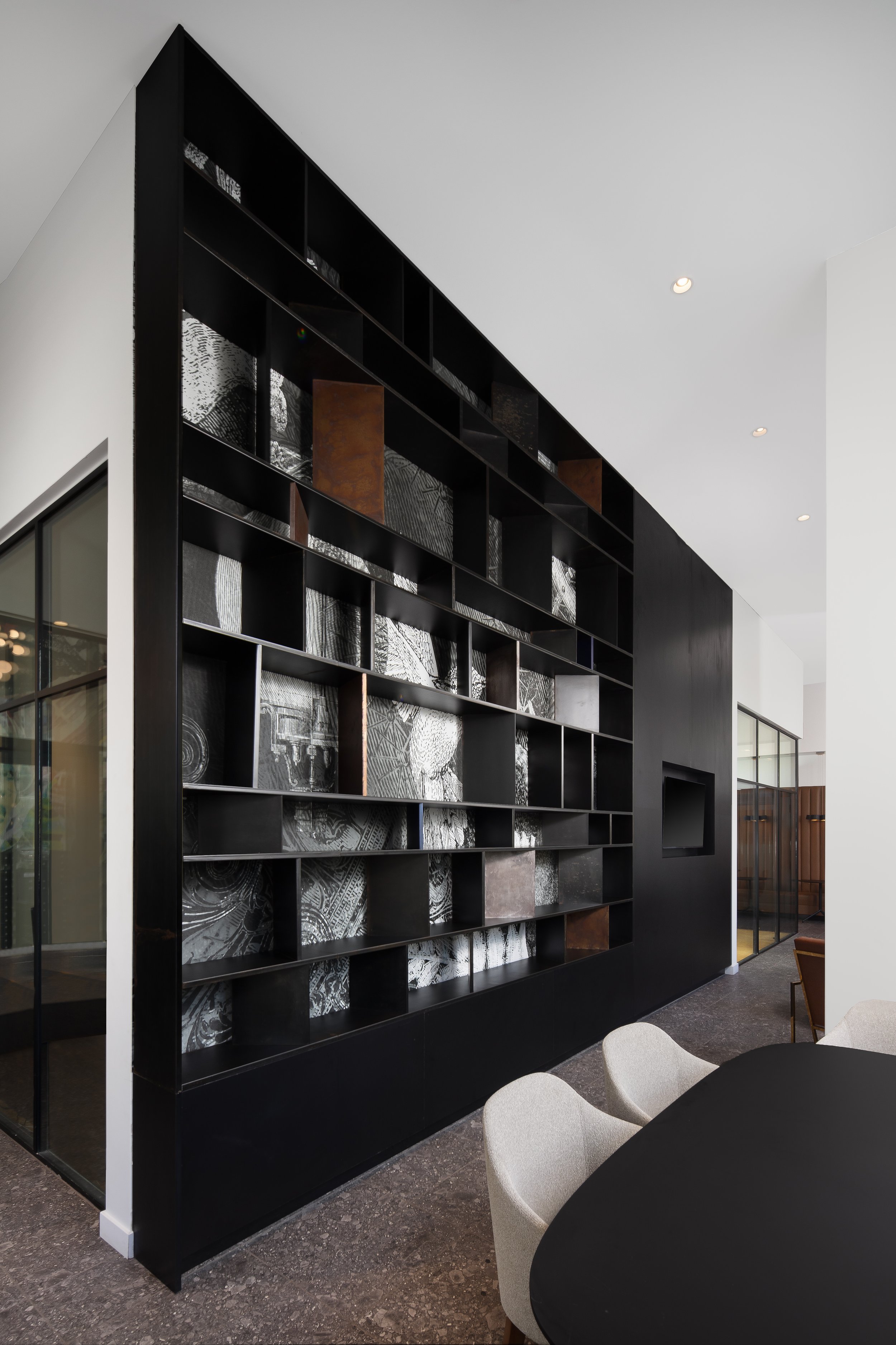
What I loved about the exterior of The Helm is its nod to the minimalist and modern architecture style, while not feeling too cold. Of all the homes and apartments I’ve worked with, Affirmed Housing always adds a little magic into their spaces. Just look at how gorgeous this common dining space is! I love the luxurious metals complimenting the really cool tile work of the bar.
Shooting The Black And White Apartment Interior
While the common areas are really bright and poppy, the apartment’s interior is much more moody and stark. Personally, I love this contrast. The only pop of color is the green tile on the base of the island , but it proved quite difficult to capture. After a lot of trial and error fiddling around with my camera settings, I got the tiles to brighten up just enough to add that bit of depth.
As for the angle, I worked a little bit with various sides, but sometimes straight-on works best. While I love to try new things, I always go back to the basics. They always do the job perfectly.
Highlighting The Bright Colored Murals
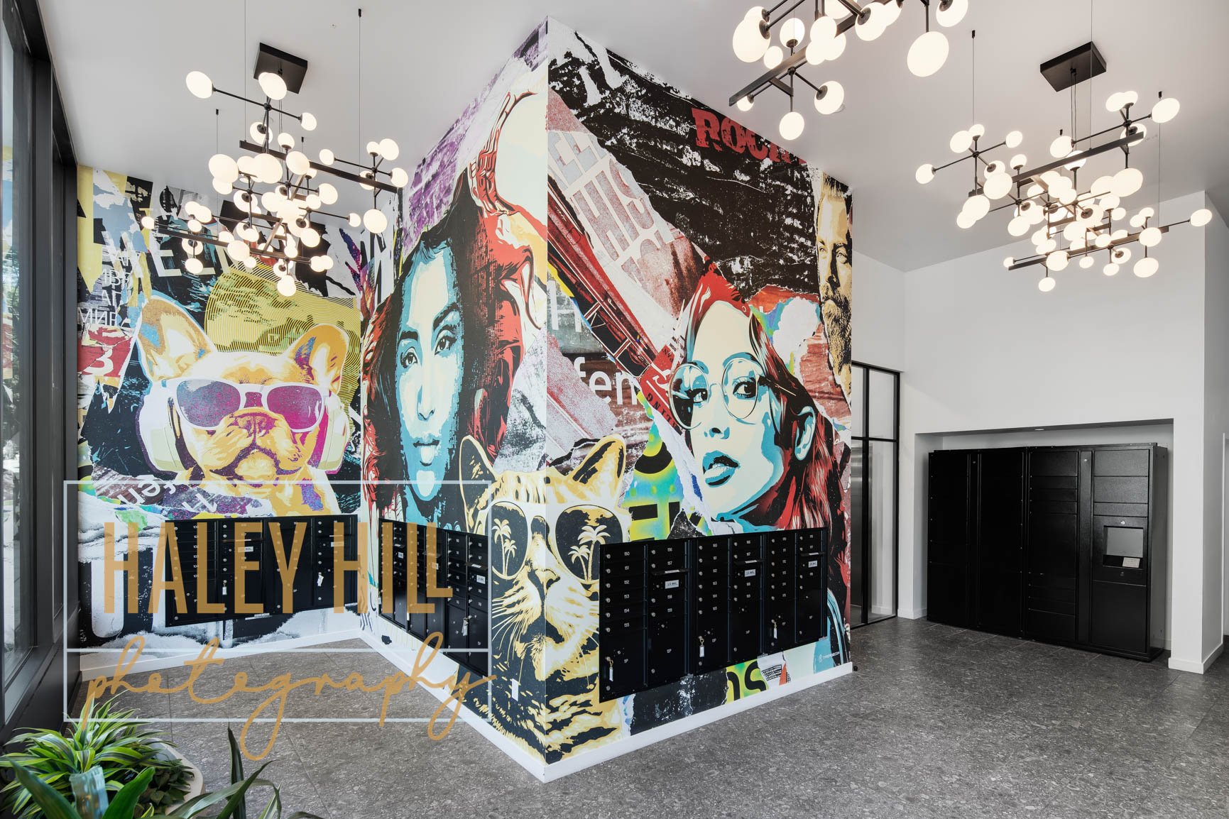
One of my all-time favorite features in any common space (whether it be business, apartments, etc…) is a mural. They’re absolutely gorgeous! Carrier Johnson did an absolutely stunning job at playing between modern, muted tones, against bright colorful pops. The end result adds so much character. To shoot a mural of this width and hight, I worked primarily with tilt shift at an angle. To read all my thoughts on tilt shift photography, check out my post here.
As always, it is such a pleasure to work with Affirmed Housing on any of their projects- the people and mission behind it is really powerful. If you’re interested in working together on a future shoot, please don’t hesitate to reach out!
Owner: Affirmed Housing
Architect & Interior Design: Carrier Johnson + Culture, Design X
General Contractor: HA Building Group, Bandak Project Management
Lighting: Elluminet
Furniture: GMBI
Engineers: Kettler Leweck Engineering, MA Engineers, KPFF Consulting
Other Parties: Sonneman, Josh Veteto, form/work Landscape Architecture, California Community Reinvestment Corporation, California Housing Finance Agency, NEXUS for Affordable Housing, Weis Environmental


