Restaurant Photography | Cafe Madeleine by Design X
As a restaurant photographer, I frequently enjoy the opportunity to check out Southern California's coolest, most vibrant locations. No matter how many unique concepts I've seen, though, there's always more room to be impressed. Cafe Madeleine was one of those projects that was too cute and cozy not to enjoy capturing!
This classic corner cafe has always been a South Park treasure. Still, the recent upgrade by Design X Architecture + Interiors has transformed it into a stunning, welcoming environment with all the Parisian charm a SoCal photographer could hope for. Fun art, contrasting shapes, brilliant pops of color and texture, and tons of natural light make Cafe Madeleine truly special.
How I Planned this Restaurant Shoot
Although a relatively intimate space, Cafe Madeleine offers a lot to take in visually. My goal was to capture both the interior and exterior design in a way that flowed beautifully and encapsulated the French vibe of the restaurant. This meant lining up shots that would provide glimpses from the outside in and from the inside out. It also meant focusing on details that married the two spaces together with similar design elements while still emphasizing the unique beauty of both areas.
Spotlight on the Exterior
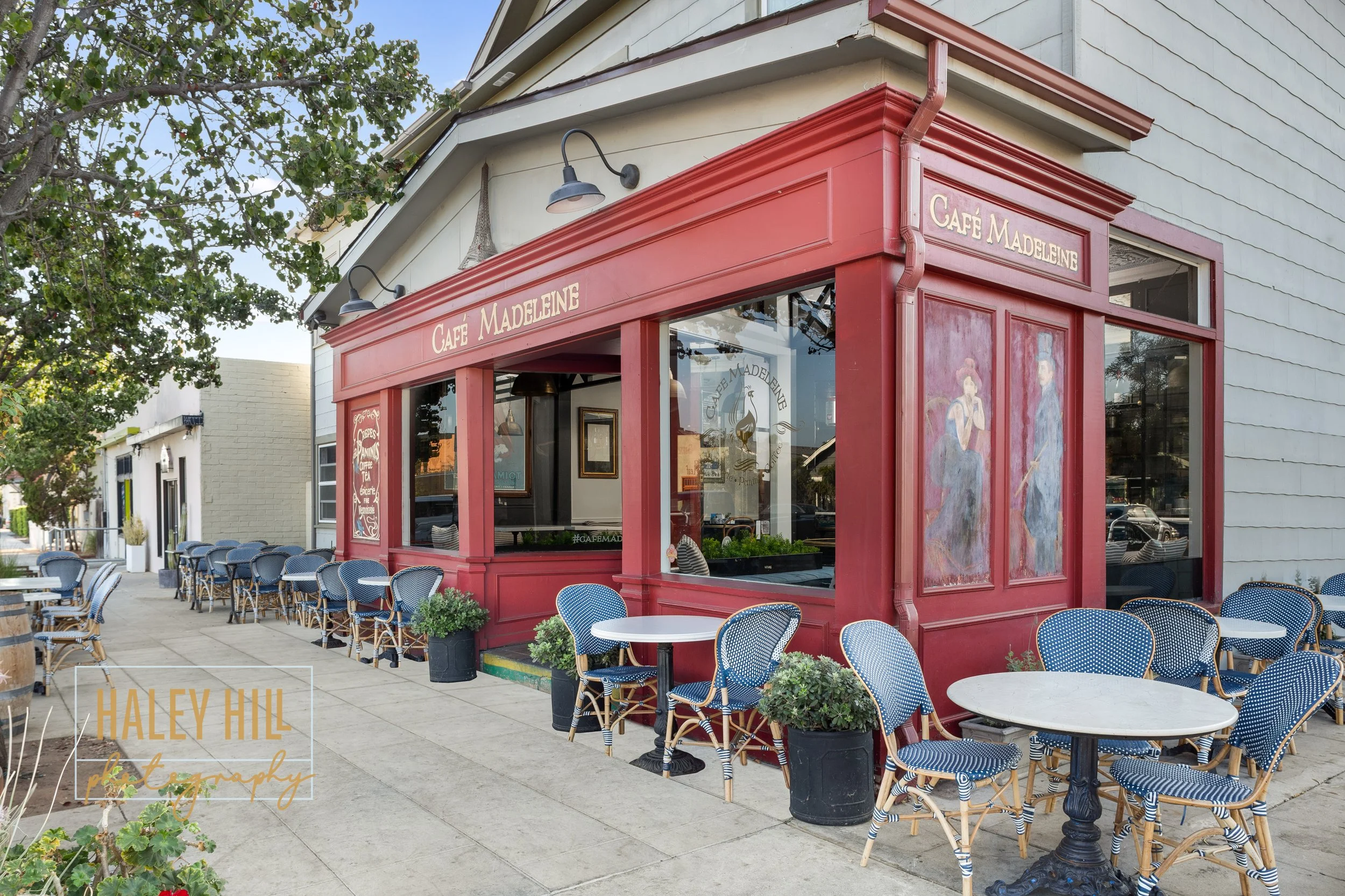
Because the restaurant's exterior is the first thing a diner will notice, I wanted to begin by putting a spotlight on the bright, bold (but never overwhelming) face of Cafe Madeleine and its sidewalk seating. Next, I worked to highlight the contrast of round tables and chairs against sharp, angular architectural details and the pop of blue and white checks against the deep red of the cafe itself. I selected this particular angle to feature all of the incredible design elements as they harmonize with one another and the nature/environment around them in one clean shot.
Highlighting the Interior
Café Madeleine's interior is simply divine, featuring an abundance of natural lighting through large windows and detailed architectural elements. I used wide angles to demonstrate how the smooth hardwood flooring, rounded, simple lines of the interior chairs and lighting fixtures, and smooth, sleek countertops created a soft contrast to the ornate ceilings, detailed coffee bar, and textured picture frames surrounding each piece of art.
Emphasizing Art
As a restaurant photographer, my job is to highlight what makes each dining concept so fresh and unique. In the case of Café Madeleine, one of its most original trademarks comes from its French-style art that flows from the exterior to the interior. For this reason, I ensured that my exterior shots focused on a couple of art details on the building's front and side panels while also picking up on some of the interior art through the large window panes.
Haley’s Hints: Connect the dots! Restaurant photography often means focusing on both interior and exterior dining spaces. Therefore, finding ways to integrate the two environments cohesively is essential. This prevents making the restaurant seem disconnected.
TO CAPTURE YOUR NEXT RESTAURANT PROJECT, CLICK BELOW:
Interior Design: Design X Architecture + Interiors
General Contractor: Wheelihan Construction
Furniture: Handbuilt Furniture + Fabrication


